Modern space design is often associated with clean aesthetics, minimalism, and technology.
However, this very apparent simplicity leads many to make structural and functional errors that emerge only after months of daily use.
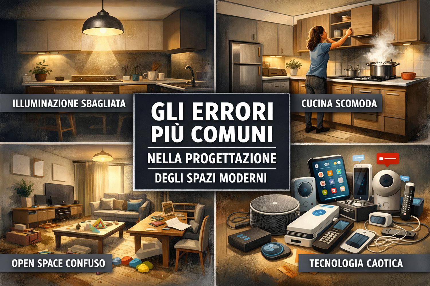
In this article we analyze the most common mistakes in designing modern spaces , explaining why they occur and how to avoid them right from the design phase.


1. Prioritize aesthetics over functionality
The mistake
One of the most common mistakes is designing a space that is beautiful to look at but uncomfortable to live in .
Clean lines, continuous surfaces, and suspended furnishings only work if supported by a real analysis of everyday use.
Why it happens
-
- Influence of “perfect” images seen online
- Poor analysis of real habits
- Designed for wow effect, not for durability
How to avoid it
· Designing starting from everyday gestures , not from style
· Simulate paths, openings, flows
· Always ask yourself: “Will this space still be comfortable in 3 years?”
2. Underestimated or poorly designed lighting
The mistake
Use a single central light point or rely exclusively on decorative spotlights.
Why it's a problem
In modern spaces, light creates volume , separates functions and influences visual comfort.
Typical errors
· Cold light everywhere
· Shaded operating areas
Correct solution
·
· Layering lighting (ambient, functional, accent)
· Integrate light into the design, don't add it at the end
· Thinking of light as an “invisible material”
·
3. Open-plan spaces without any real hierarchy
The mistake
Open spaces that are too open, without clear functional boundaries.
What happens in practice
· Widespread noise
· Visual disturbance
· Feeling of chaos instead of continuity
How to design better
· Use changes in materials, heights or lighting
· Insert filter elements (islands, bookcases, light curtains)
· Clearly define functions without closing them
4. Modern kitchens designed as “objects”, not as tools
The mistake
Beautiful, but impractical kitchens:
doors without grips, delicate surfaces, poorly positioned appliances.
Main causes
· Little attention to ergonomics
· Layouts copied without adaptation
· Product-centric design, not usage-centric design
How to avoid it
· Study the work triangle and flows
· Evaluate materials based on actual use , not just aesthetics
· Integrating technology in an invisible yet accessible way
5. Ignoring evolving needs over time
The mistake
Designing a perfect space just for the present .
Why is it risky?
The modern home must adapt to:
· family changes
· remote work
· new technologies
· lifestyle changes
Correct strategy
· Provide flexibility
· Use modular furniture
· Leave “room for adaptation” in the project
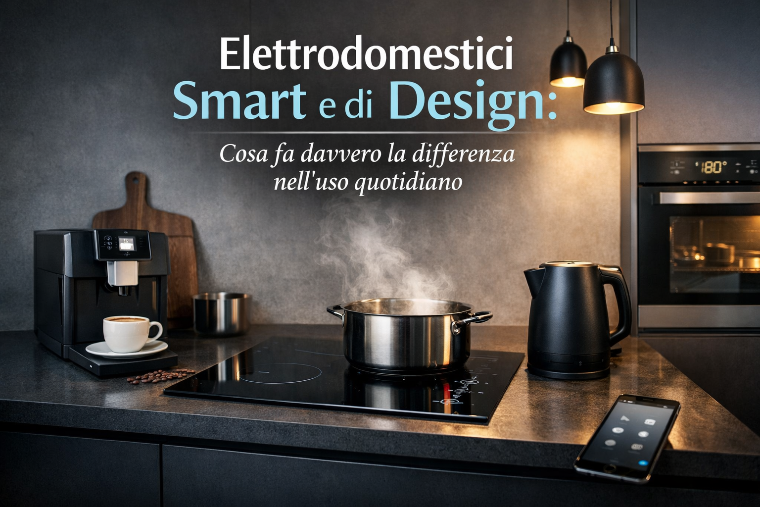
6. Accumulation of technology without logic
The mistake
Home automation, smart appliances, and advanced systems implemented without a strategy.
Result
· Unnecessary complexity
· Frustration in use
· Technology that is being abandoned
Correct approach
· Technology should simplify , not complicate
· Each element must respond to a clear need
· Better less technology, but well integrated
🔎Learn more about the topics
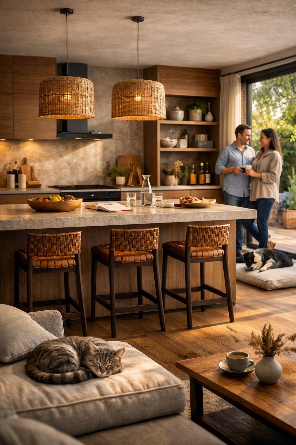
Conclusion: Modern space only works if it is designed for people
A modern space is not modern because it is minimal or technological,
but why it works well in real life .
The real mistake is not getting a style wrong,
but not designing starting from the daily experience of those who live it .
Leave a comment
This site is protected by hCaptcha and the hCaptcha Privacy Policy and Terms of Service apply.